
Gov. J.B. Pritzker
Gov. J.B. Pritzker
Gov. J.B. Pritzker is being bashed for using an easily manipulated chart as a reference point for his broad closure of the state’s economy.
Pritzker, who was already one of the nation’s least popular governors, has been under intense pressure this week as many restaurants in the state have determined they will defy lockdown orders. Now, in an apparent smoking-gun display, online sleuths revealed that a graph tweeted by Pritzker incorrectly reflects the reality of the state’s day-to-day Covid death rates.
“Unfortunately I’m afraid we can expect much worse to come,” Pritzker gravely tweeted along with the graph.
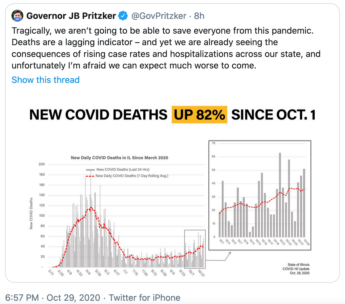
Pritzker's tweet in question.
Pritzker has been issuing daily notices for regions across the state. Most recently, he announced increased regulations in Chicago that would shutter restaurants.
Critics are saying the graph Pritzker used in the tweet relies on the day the deaths were announced, rather than when they actually occurred.
“This graph is a lie,” a Covid researcher who goes by the name Emma Woodhouse tweeted. “It’s not a graph of daily deaths. It’s a graph of the deaths that have been announced each day.”
The data reported numbers rather than actual numbers, which can result in a wide variation in the number of deaths reported on any given day. Thus, the graph’s claim that Covid deaths are up 82% could be widely inflated and not indicative of the trajectory of death rates.
Misleading graphs have long been deployed as a way to persuade mass audiences.


 Alerts Sign-up